Hello, handsome, is that a ten-gallon hat or are you just enjoying the show?

Title

I’m sure many of you are familiar with the film I chose to explore and with good reason! Blazing Saddles is written and directed by Mel Brooks and is one of the funniest, most exciting, and satirical films I’ve ever seen! The film opens in a small town set in the West, released in 1974 Westerns were incredibly popular at the time and this film was no exception! Our hero Bart (Cleavon Little) is a black man in the South, disadvantaged but very intelligent. The town sits on a valuable location and Hedley Lamarr (Harvey Korman) a political man wants it for himself! Their sheriff has been killed by the goons hired by Hedley to drive them out so they reach out to their Governor none other than Mel Brooks himself! Governor William J. Lepetomane (Mel Brooks) appoints Bart after counsel from Hedley, thinking these good Western folks will not tolerate a black sheriff and will run him out of town! The rest of the film is Bart and his friend Jim (Gene Wilder) and his love interest Lili Von Shtupp (Madeline Kahn) fighting Hedley and his goons to save the town! The film uses satire to explore public opinion in regards to politics, racism, land grabbing, and sexism. Every scene in this movie feels like it has a hidden message and often if you look close enough you’ll find one.

Sheriff

Bart

The film utilizes sarcasm on Bart’s part about racial tensions and class divisions; Bart often jokes with citizens of the town and uses slapstick humor with his buddy Jim. As in most Mel Brooks movies there is an element of seriousness to his satire, these are all very real issues of the time period and exploring them with humor allows viewers who might otherwise not notice the issues to feel free to dive in!

Hedley Lamarr

Governor Lepetomane and Hedley Lamarr

This film utilizes a lot of the same lighting techniques as the 40s and 50s, meaning three spots or five spots focused on the actors. However they shot a majority of the scenes outdoors in the daylight since it is easier to see that actors in natural light; this was very common in Westerns during the 70s. The idea was to bring the viewer out onto the plains with the actors and promote a sense of realism. Some of Von Shtupp’s scenes are shot boudoir style which adds to her allure! I personally prefer the daylight scenes, and the low camera angle used especially when they are lined up on their horses contemplating dastardly plans! This is seen a lot on ridges or hill tops when the riders rein in their steeds.

Indian Chief

Indian Chief

Mel Brooks played multiple roles in his film, and one was the obviously racially stereotyped Chief seen above. During this time period Indians were being forced off their lands for settlers, and rounded up to be dealt with by the U.S. government, Brooks chose to explore the role this group played in the West and it’s conflicts with his trademark brash humor. I absolutely loved the speech patterns he used for this character, and the costumes were wonderful too! Eventually as in all good Westerns, Bart triumphs over the sneaky Hedley Lamarr and saves the town, they recognize his worth as a Sheriff, and Von Shtupp recognizes Bart as a true gentleman no matter the color of his skin. I highly recommend you watch this movie with some popcorn and some friends it is sure to have you laughing!

Sources

http://www.imdb.com/title/tt0071230/

http://nypost.com/2014/05/03/mel-brooks-10-things-you-never-knew-about-blazing-saddles/

http://insidemovies.ew.com/2014/05/01/blazing-saddles-mel-brooks/

http://www.filmsite.org/blaz.html

Communication In Art

I chose two artists who both used their art to communicate messages. One boldly and with actual statements, the other more subtly through images portrayed in his works. These two artists are Mark Tansey and Barbara Kruger. First we will explore a little bit about Tansey. Born in 1949 to art historians I’m sure Tansey grew up exposed to all kinds of art as well as techniques. Tansey tends towards monochromatic imagery but his paintings are powerful nonetheless. Some of his works had a social message like Purity Test painted in 1982.

native Americans

Purity Test 1982

The spiral the Native Americans are looking at is called Spiral Jetty by Robert Smithson, however the native Americans don’t know it is supposed to be art and are trying to interpret it as a symbol. I think this is a commentary on what we do every time we look at art. Effectively I believe Tansey is equating the viewers with the Native Americans looking for symbolism when there might not be any. Or conversely thinking an event is natural when in fact it is man-made. Apparently the Spiral Jetty disappeared when the water level of the body of water it is located in rises, I”m sure this appeared quite mystical to native Americans at the time.

Tansey also painted The Innocent Eye Test in 1981 which I believe is also a commentary on the way we view art. In this painting a cow is being shown a painting by some gentleman, and they want to see what the cow’s reaction is. I believe Tansey was attempting to show us that when an artist is unveiling a new piece, we are the cow and he simply wants to see what our reaction is. It is quite a funny painting it has all the ceremony of an unveiling…but with cows instead of people!

Innocent Eye test

The Innocent Eye Test 1981

Something I noticed was the use of the word test. When I think of tests I think of passing or failing,and I wonder what exactly the reaction would have to be for the piece to fail. The last piece I chose by Tansey is a little bit more humorous, and in keeping with his style monochromatic. I particularly love the impatience the female character is communicating to the man who is attempting to open the gate with his key. You can see it in the way she holds her body, tilts her head, and how he appears to be rushing to open the gate. This painting to me communicates the attitude of women of the era he chose to portray, which I think is the 40’s or 50’s as he has several paintings featuring people from that time period. Glamorous movie stars like the woman I imagine in that gown didn’t wait for anything and certainly not for a man to find The Key!

phantasmaphile

The Key 1984

So where Tansey communicates his messages through humor, reflection, and more subtle cues, which makes the viewer work more to understand and digest the message; my second artist Barbara Kruger literally pastes statements across imagery to challenge the viewer.

Kruger is a social activist and often uses her art to draw attention to her cause. Kruger was born in New Jersey in 1945 and is an avid feminist and fights against the idea presented by consumerism that women’s bodies are a commodity. Kruger often selects images in popular magazines and then creates phrases designed to incite passion, stir thought, and challenge beliefs. I chose several pieces because I love the boldness of her work.

barbara-kruger-your-body-is-a-battleground-19891

Your Body Is A Battleground 1989

This piece is a commentary on the issue of abortion and how rights regarding women’s bodies, and things happening inside of them are being decided by external forces (legislators) and yet directly affect women’s lives. I absolutely love how Kruger speaks directly to women and basically has created a call to arms. Kruger’s message is no subtle blending of cues, it is a kick to the face and I appreciate that boldness.

Pro Life Barbara Kruger

Pro-Life for the Unborn Pro Death for the Born 2000

Again this piece is a commentary regarding abortion and the hypocrisy surrounding fighting for the right of an unborn fetus to be brought into this world only to starve, live on the streets, not have access to medical care by cutting entitlement programs and not supporting mothers. This piece asks the question why do the people making these laws care about the child before it is born and not once it is outside the womb. I think she specifically pictured Bush because he was a representative of the party known for pushing the anti-abortion agenda. Again she is not subtle, she is communicating quite clearly her opinions regarding this hypocrisy.

barbara_kruger_14

If We Can They Can Unknown

I picked this piece because of all the legal changes regarding gay marriage lately. I love the symbolism of two people holding hands, united, and that she used the bold red color to divide the image. I think this symbolizes the way some are trying to keep gay couples apart by not legally recognizing their unions when they are actually already a unit. I love this piece and how she again chooses to communicate so boldly, however I do think this piece has more of a hidden message due to the placement of the color on the photograph.

Both of these artists communicated with their viewer and what I really enjoyed was the variety in how they chose to do so. Tansey evoked ideals of days gone by, his color palette was deliberately old fashioned, and because of his painting method he had to create his works very quickly. Kruger used a more modern medium of magazine photographs covered with bold colors and words but both artists communicated the need for their viewer to think, really think about their world and what goes on in it.

Sources

http://www.artchive.com/artchive/ftptoc/tansey_ext.html

http://www.evl.uic.edu/davidson/CurrentProjects98/ET_VisualInfo/Mark_Tansey.html

http://www.barbarakruger.com/biography.shtml

http://www.arthistoryarchive.com/arthistory/feminist/Barbara-Kruger.html

http://www2.palomar.edu/users/mhudelson/StudyGuides/20thCentLate_WA.html

The Great Depression

This era has been of huge impact in my life. I was raised by my grandmother and she experienced some parts of the Great Depression and as a result had some behaviors and beliefs that she passed along to me and still continue to influence me today. I was extremely excited to explore the art of this time period and see some of what she might have seen. I was particularly drawn to images of the working class, as my grandmother was a member of that culture. I will explore the art created during this time with the angle of interpreting changes in society at the time, and how they were reflected in the art created. The first piece I chose was created by Hugo Gellert in 1933 and titled The Working Day, no. 37. I chose to focus on works by Hugo Gellert because I wanted to create a sense of his viewpoint of the time and I particularly enjoyed his focus on the working man.

The Working Day, no.37

The Working Day, no. 37. 1933

I love this piece, Hugo was a political activist who wrote as well as drew and often his art was a representative of his writing since the two were tied inextricably together. This piece was created I believe to show how both African Americans and Caucasian working men were experiencing the Great Depression, back to back with tools in hand. These were no weak men shirking their duties, they faced the difficulties of the day unflinchingly and with determination. This is clear in the broad shoulders, large muscles from working long hours, and their clothing, designed for hard work. This piece to me speaks of pride, determination, and a willingness to work together, these men are not at odds they are comrades. All qualities needed to build a life in the Great Depression.

Primary Accumulation 19

Primary Accumulation 19. 1933

In keeping with his portrayals of working men, the man in this piece, Primary Accumulation 19 is muscular and dressed for work. The character’s hand is clenched, in anger or determination, and his neck muscles are clearly bulging from the force of his shouts into the bullhorn. This man is speaking to the crowd, probably leading one of the many strikes that occurred during this era as men pushed for better working conditions, better pay, and better working hours. The idea of the 8 hour work day was relatively new at this time, and previously men were used to laboring as long as there was light and sometimes after; 12 hour days were not uncommon, but during the Great Depression working men began to push for a balance of their work and home life, and one of the ways they expressed their discontent was through labor strikes. I love the intensity of this drawing, the energy I can imagine he created in the crowd as he used his body honed by years of hard labor to physically make his point, lashing his hand through the air.

A Wounded Striker and the Soldier

The Wounded Striker and the Soldier. 1936

As sometimes happens with strikes and riots, oftentimes police were called in to disperse the crowds. Wealthy factory and mine owners did not want their labor force banding together and sowing discontentt so they often used their connections with the police force in order to physically deter protesters from staying in their groups. This piece shows a soldier with his bayonet point at the neck of what is clearly another working man, the same overalls and broad muscular shoulders, and the same chiseled jawline. Clearly Gellert envisioned the working man as strong and shaped by his work, in contrast the soldier is not as well built nor as defined facially. Perhaps this was done to create the impression of uniformity among the soldiers, we may never know. I can’t help but wonder if Gellert is trying to call to mind the saying “stabbed in the back” by the positioning of the bodies in this picture, since in fact the soldiers were working men as well, just working for the interests of the wealthy.

I greatly enjoyed all of Gellert’s works, and he often used the same title but added numbers afterwards for his pieces, thereby creating a series. If you want to know more about his political leanings, and his experiences during the Great Depression I highly recommend visiting the links I’ve provided. Hugo Gellert was originally born in Hungary but immigrated to the United States, his life was touched by WWI like many people of the time when his brother was called to serve. Gellert’s brother was a conscientious objector who refused to participate in the war and was placed in military prison where he was suspiciously shot and killed. Military information claimed it was suicide but the circumstances said otherwise and I believe this event helped drive Gellert to create the art he did. Gellert used his drawings to highlight the rampant greed of wealthy railroad barons and steel tycoons, as well as to highlight the strength and fortitude of the working class; he rallied people behind images they could understand and relate to and I believe had a huge impact on society during the Great Depression.

Sources

http://www.english.illinois.edu/maps/depression/artgallery.htm

http://allinsongallery.com/gellert/index.html

http://www.graphicwitness.org/contemp/gellert1.htm

http://www.aaa.si.edu/collections/hugo-gellert-papers-7845/more

Impressionism vs Cubism

Impressionism

I chose to study these two types of art because they are so completely opposing. The soft brush strokes, and dabbing of the Impressionist art works are the polar opposite of the sharp edges and clearly delineated lines of Cubism and the difference in subject matter is also extreme. I love when you have two opposing ideals and both have a following, it creates such interest in the pieces. Where Impressionist artists created a mood, a sense of emotion with their pieces, Cubists focused on the logical exploration of space and structure in their paintings, the focus was not so much on what was happening in the picture but on how it was being presented to you. So I will start with two of Claude Monet’s paintings, because I love that some of his works focused on his wife Camille. Actually quite a few of his works involved her but one of the most well known is Woman In a Garden painted in 1867. Monet created a large portion of his art in Paris, a fertile ground for the imagination I understand, and this work was created there as well.

Woman In a Garden

Woman In a Garden 1867

As you can see it is a very good representation of Impressionist art because the choice of colors, almost dream like as well as the soft brush strokes, and slightly rounded dabs are very typical of the style. I love this piece because I can so clearly imagine myself standing behind this woman, relaxed and at peace in this tranquil setting. Monet was quite in love with his wife Camille by all accounts and I think you can see that reflected in how he paints her, almost angelic with her white dress and stately presence.

The next piece by Monet I chose is called Springtime and was painted in 1872 also in Paris. This again focuses on a woman, and it is incredibly beautiful. The piece is not known to have been of Camille but I think it’s a strong possibility. Camille died in 1876 of tuberculosis and I’m sure it must have been a comfort to Monet to have so many pieces to remember her by.

Springtime

Springtime 1872

If I had to imagine walking through a French garden, looking for a young lady, this is what I would picture. The piece is so incredibly still, like she’s frozen in time there. I love Monet’s ability to capture a perfect moment, and take you there, make you feel what he must have felt looking at his subject. Monet said himself he was incredibly drawn to color and that he spent vast amounts of time on shading and perfecting his technique. Monet passed away in 1926 and it is still possible to tour his home and gardens in Giverny.

Cubism

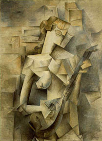
Cubism is very different from Impressionism in that artists focused on this style of painting were not so concerned with realistic shapes and sizes, and often their paintings looked almost flat. I chose Pablo Picasso and his work Girl With a Mandolin because I clearly enjoy paintings featuring women. I also think having the same subject matter will help illustrate the differences in style quite clearly. Picasso painted this piece in 1910 when he was going through his Synthetic Cubism period.

The Mandolin

Girl With a Mandolin 1910

The subject may be a woman but Picasso has chosen to totally deconstruct the image and rebuild it, forcing the viewer to think about what they are looking at and really examine their perspective. Picasso wanted art to be an experience, a change in our view, and something we thought critically about. This attitude greatly influenced art to come for years.

My last piece is more current, meaning it’s from this century and it is by Thomas C. Fedro and of course features a woman! In fact it is called Princess For a Day and was painted in 2006. This piece has all the angularity, bold lines, and change in perspective associated with Cubism but features more color which is something I love!

Princess For a Day

Princess For a Day 2006

I saw this painting and just fell in love. I felt like I was looking at the Lady of the Lake or another medieval figure but the way Fedro painted the piece feels so modern I’d be happy with it in my living room! You can see how vividly his portrayal captures this princess and she has an almost peaceful expression on her face as well.

All of the artists featured in my comparisons were male, and all of them chose to paint women, and I believe they did them justice. From the Impressionist serenity to the bold Cubism, I’d be happy to be painted by any one of them, or own one of their works.

Sources

http://en.wikipedia.org/wiki/Claude_Monet

http://www.pablopicasso.org/

http://robinurton.com/history/cubism.htm

http://www.ebsqart.com/Art-Galleries/Contemporary-Cubism/43/Princess-For-a-Day-Cubist-15/321818/

Converging Interests

Neoclassics and The Middle Class

In studying the Classical era I learned quite a bit about the power struggles of the upper class as well as the development of a new group, the wealthy middle class. I am choosing to study the middle class specifically because I think that the creation of this group is really what heralded the American Dream. When I picture America I think of an individual working hard, overcoming obstacles and eventually creating a comfortable life. This to me embodies the idea of “middle class” and since this is such a complicated concept I thought showcasing art that was created for and inspired by this group might help my reader understand the connections I have made. The first piece I have chosen is The Death of Socrates by Jacques Louis David which features Socrates being given the choice between renouncing his belief or drinking poison. The reason I believe this painting was popular with the middle class when it was created in 1787 is because of their search for respectability, and entrance to the upper echelons of society. In order to establish themselves as legitimate members of society even without blue blood, middle class families often showcased pieces featuring Greek and Roman scenes of morality and virtue. Previously only the wealthy nobles could afford these kinds of art, even though their pieces were from antiquity and not “reproductions” as some called the efforts purchased by middle class families. This painting with it’s Greco-Roman theme, realistic figures, and moral message is perfectly representative of the Neoclassical style and was painted in Rome.

The Death of Socrates

The Death of Socrates

I chose a musical selection by Christoph Willibald Gluck called Ezio which was created in 1750 in Prague. If you want to hear the selection I’ve added a link. http://www.youtube.com/watch?v=KZ_lYYfeDXs

The reason I specifically chose this piece is because of the drama it creates. The crescendos are perfectly timed to the vocals and really create an emotionality to the piece that I love. Gluck was a popular composer later in his career, when he was producing his operas there were several critics like Handel who did not enjoy them and had no qualms speaking out about it. However it is worth noting that his operas were often played 20 times in a particular city which is quite a feat. People often became bored hearing the same thing over and over and having your piece chosen for repeat performances so many times means either it is well loved or so many people are curious about it they need multiple performances! Either way it’s quite impressive. Gluck spent quite a bit of time at the Hapsburg court, who are as we know famous for their patronage of the arts, and was himself German. I like his music because I don’t speak Italian or French but I feel like I still understand what they are singing due to the emotional range created by the instruments in the background. This is one of the things I look for in classical music since so much of it was in Italian, French, and Spanish.

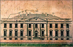
White House 1  

Original Sketch by James Hoban

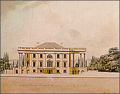
   White House 2                        

Drawing by Benjamin Henry Latrobe

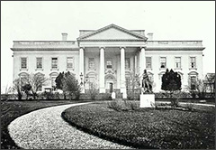
    White House 3                                                                                                                                                                                                            Photograph,  1860

Lastly I wanted to choose a sculpture or piece of architecture to really round out my study and so chose one of the Neoclassical Palladian buildings, The White House. Most of the people I’ve spoken to don’t realize that the columns of the White House as well as the classical entrances were inspired by Andrea Palladio an architect from the Late Renaissance. The White House was worked on by many different architects over a long period of time but is credited to James Hoban. Different presidents have added on and altered things during their time in office like garden houses, and extra terraces, as well as entire wings. There are also several conspiracy theorists who believe the White House has secret underground bunkers located throughout the grounds. I’m not sure how much credence I’d give to that idea however.  The balanced look of the building, columns that go all the way to the roof of the building, as well as the choice to make the house white are all reminiscent of the marble temples of the Greek and Roman times. Pierre Charles L’Enfant who originally conceived the idea of a home for the president that would be impressive as well as symbolic was let go by George Washington, some believe for insubordination and since Washington was a military man I can well believe it! Most sources agree however that George Washington was heavily involved in the planning and execution of the creation of what would become a symbol of American democracy, and the echoes of Greek and Roman styles are seen in the building; essentially the entire structure is an echo of the founders of democracy. Again Washington and his compatriots were creators of part of this new class of people, not the aristocracy of Europe but neither the servants, an entirely new breed called the middle class.

White House 4

The White House, 2014

In conclusion I hope you’ve come to see how the Greek and Roman traditions as well as focus on morality and virtue were emulated by Neoclassical artists, and the part they played in forming homes, art, and music of the time.

Links

http://www.metmuseum.org/toah/works-of-art/31.45

http://www.britannica.com/EBchecked/topic/152567/Jacques-Louis-David/276673/Rise-to-fame-1780-94

http://www.classical.net/music/comp.lst/stravinsky.php

http://www.britannica.com/EBchecked/topic/235806/Christoph-Willibald-Gluck

http://www.essential-humanities.net/western-art/architecture/neoclassical-romantic/

http://www.whitehousehistory.org/history/white-house-timelines/architecture-1790s-1840s.html

Trevi Fountain 1762

trevidaylight

Creation

I chose to study the Trevi Fountain in Rome, and once I explain why I think you’ll agree it is a masterpiece! First I need to explain how massive the undertaking the creation of this fountain was, this piece was originally conceived by Pope Urban VIII as a restoration of the Aqua Vergine aqueduct but he died before it was started. Then the new Pope in 1732 commissioned Nicola Salvi to create the fountain who used the sketches of the artist originally chosen Bernini for inspiration. 100 years passed in the meantime! The Pope chose to have this fountain created as part of the Counter-Reformation movement, under direction from The Council of Trent and I think it was an excellent choice, what better way to show the beauty and strength of the Church as well as it’s wealth than through a stunning piece. If ever there were a piece of art to inspire people it’s Trevi Fountain.

Physical Characteristics

The fountain itself took 30 years to complete, and it is incredibly large standing 25 meters tall and 20 meters wide. It was very difficult to find detailed photos of the piece because you would need to wade through the water or use a telephoto lens! The fountain is a huge tourist draw and many believe if you toss a coin in over your shoulder it means a return trip to Rome.

The fountain features Neptune or Poseidon depending on who you ask as the central figure, as well as Tritons, which were basically helpers or an escort. They are holding the reins for two sea-horses who represented the capriciousness of the sea, at times gentle and lulling and at others wild and reckless. There are also two women standing in the background, creating a sense of balance, one of which is said to be Agrippa the girl after whom the original aqueduct was named. Finally, there are plaques for the Pope who originally commissioned the work and a second one for the Pope who oversaw it’s completion which I felt definitely adds a touch of history to the piece showing the passage of time.

Highlights

I also chose to include a picture of the fountain at night because the locals have positioned lights all around the statue at night to create a dramatic and quite striking effect.

OLYMPUS DIGITAL CAMERA

I found this piece beautiful and awe-inspiring and to be frank a little intimating. I cannot imagine spending 30 years of my life working on a piece of art, then I see this amazing monument to human creativity and I think, thank goodness someone can! Salvi must have been consumed with love for this piece to dedicate that much time and attention to it. I love Greek mythology and the ocean, even though I’ve yet to see it personally, and this piece perfectly conveys the power of the sea and Neptune’s dominion over it! I recommend if you can take a vacation to go see Rome and especially Trevi Fountain!

Contrast

Fountain of the Turtles

To show how different fountains in the Renaissance period were I’ve chosen Fontana delle Tartarughe, or “Turtle Fountain”. I picked this fountain because it is whimsical enough to make me smile but still represents the aesthetics prized during the Renaissance. While the Baroque period emphasized wildness, abandon, and passion in its subjects the Renaissance period focused on mastery of technical skill, clean flowing lines, and restraint. In “Turtle Fountain” you can clearly see which part of the statue is a turtle, a shell, or ephebes. This is in stark contrast to the almost reckless details in Trevi Fountain where carved waves seem to crash at the feet of Poseidon and the statues almost seem ready to leap off the rocks. “Turtle Fountain” meanwhile creates a sense of orderly peace, a calm pool to reflect in and not the raging passion of the sea through the small streams tumbling down, and the small basins. Also of note is that Jacopo Della Porta designed part of the fountain and the statues were created by Taddeo Landini, so two artists were involved in creating this fountain just like Trevi Fountain!

Sources

http://www.worldsiteguides.com/europe/italy/rome/trevi-fountain/

http://www.trevifountain.net/

http://www.italianways.com/bernini-symbolism-and-a-sweet-conclusion-the-turtle-fountain-in-rome/

Bacchus 1496-1497

Bacchus, God of Wine

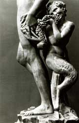
Bacchus is a fairly well known figure in Greek and Roman mythos, although he does also go by the name Dionysus. Michelangelo Buonarroti chose to portray this god of wine and vegetation in stone; Bacchus is carved from marble, a painstaking process which would have required an enormous investment of time and effort. Michelangelo was rumored to be able to see the sculpture he wished to unearth within the block of stone, and the detail evident in Bacchus would certainly give credence to that theory. Bacchus stands 80 in. tall and is currently available for viewing in the Bargello Museum in Florence and I hope some day to see it in person. The piece was commissioned by Cardinal Raffaele Riario and created in Florence, and was eventually transferred to Jacopo Galli’s home because the Cardinal did not seem to like the piece. Critics like Ralph Lieberman have said he may have disliked the piece because of ” the awkward pose, the somewhat vulgar face, and the softly effeminate body”.

Most of the reviews I found for this piece were not positive and in fact some consider this sculpture an insult to Bacchus as he is clearly portrayed inebriated. However, I think that speaks more to our opinions about drunkenness as a society and less about how Bacchus himself would have felt about being seen intoxicated. Bacchus enjoyed revelry, drinking, losing oneself in the moment and I think he would have enjoyed having those moments of release etched eternally in stone. One detail noted by several scholars is that several of Michelangelo’s works were unique in that he created a high center of gravity creating an impression of a precarious position, one on the verge of a fall. This was different because most artists of the time wanted to create aesthetically pleasing balanced figures that would also not be in danger of tipping over! I personally feel it gives the piece a sense of realism, almost like Bacchus really is standing in front of me, lurching drunkenly. If you look at the piece Bacchus’ left shoulder is leaning backwards at the same time he stands hip shot, almost clutching the faun for balance!

Base of Bacchus

The smaller figure in the back is a faun, often portrayed with Bacchus in the midst of his revelry.

Influences

Michelangelo had a very famous patron in Lorenzo de’ Medici or Lorenzo the Magnificent if you prefer. Lorenzo lived from 1449-1492 at the height of the Renaissance and was responsible for charging several of the greatest artists of the time with creating their masterpieces. these pieces would live on in museums around the world but many stayed right at home in Italy. The Medici controlled government, religious institutions, and banks, and this gave them a lot of influence in what people considered to be important art of the time. For instance having a Medici family member as a patron could make or break your career; opening up access to the best stone for your sculptures, the best workspaces, and the best inspiration in the form of beautiful young models. Often art that was created for the Medici but was not well received found itself in the hands of lesser known political figures seeking to emulate the upper echelons of society. In reality, an artist requires many things to create art, from time, to food, to raw materials and without gainful employment a patron was very often your only resource until your work became popular and began to sell.

Links

http://www2.gwu.edu/~art/Temporary_SL/129%3A255/Readings/Lieberman_Bacchus.pdf

http://www.italian-renaissance-art.com/Michelangelo-sculptures.html

Introducing…..Me!

My name is Laura, or you can call me Laelee. I’m not an artistic person, I”m more of an organized, linear soul. However, I love bright colors and I’ve recently begun experimenting with different types of clothing in bold colors. So I guess you could say my artistic side is in fashion! I did go to the San Jose Art Institute and it was beautiful, what I really love was the exhibits turning technology into art. I had never thought about how the two could go together! I can’t play any instruments, and I’ve tried everything from piano to guitar to drums. However, my fiance is in a metal band so I’m quite familiar with all the instruments. My favorite musical experience however was the time I got to view the Africans Children’s Choir, http://africanchildrenschoir.com/. Check them out!